X10CIFY
Transforming Vision into Impact
Transforming Vision into Impact
VISUAL DESIGN

Sophia Chen
Lead Brand Strategist
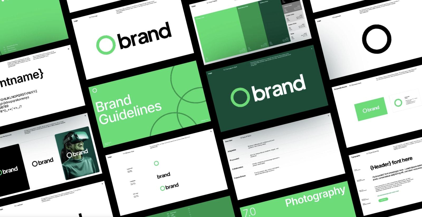
Color is one of the most powerful tools in a brand's visual identity. Long before a user reads your tagline or scrolls through your services, color registers in their subconscious, triggering direct emotional responses. Understanding color psychology is essential to select a palette that accurately represents your brand's core values.
Different colors evoke specific, cross-cultural emotional associations. Warm hues like deep oranges and rich reds trigger excitement, energy, and action, making them perfect for disruptive start-ups. Conversely, cool tones like soft blues and forest greens convey trust, security, and sustainability, which is why they are heavily favored by financial institutions and health companies.
Creating an effective digital color palette requires structural harmony. Relying on too many dominant colors can create visual chaos, while using too few can make an interface feel flat and unengaging. To avoid these issues, professional designers employ the 60-30-10 layout rule.
This classic rule ensures a balanced layout distribution: 60% of the interface consists of a dominant neutral shade (like soft cream or deep charcoal) to establish the primary atmosphere. 30% is allocated to a secondary structural color that defines card borders, navigation bars, and secondary buttons. The remaining 10% is reserved for a high-energy accent color used exclusively for call-to-actions, highlight banners, and critical links.
“A perfect brand palette should tell a story. It should evoke the exact feeling you want your users to associate with your product at first glance.
In modern web design, a beautiful brand palette is useless if it is not accessible. Ensuring high contrast ratios between backgrounds and typography is not just a best practice—it is a legal requirement under international Web Content Accessibility Guidelines (WCAG).
When designing your brand's color spectrum, always test contrast ratios early. Text elements must achieve a minimum contrast ratio of 4.5:1 against their backgrounds (or 3:1 for large, bold text). By integrating accessibility into your palette design from day one, you ensure your digital experience is inclusive and readable for all users.